A lifestyle-focused brand rooted in the slow life movement, featuring beautifully handcrafted wooden creations.
Crafting a brand that feels as authentic and handmade as the product it represents

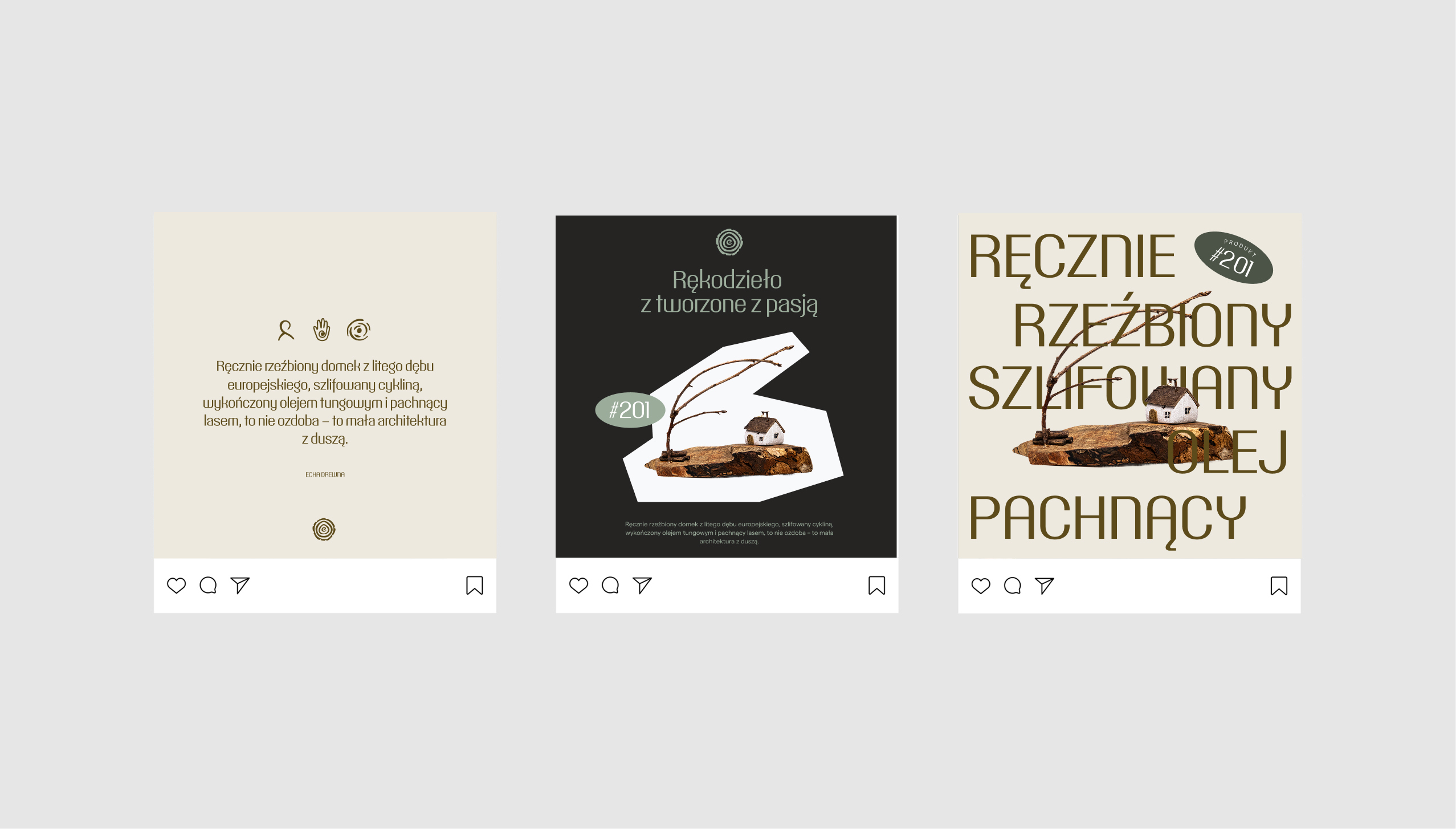
Echa Drewna crafts wooden cottages and sculptures by hand, using timber sourced directly from the landscape where the creators live. The branding was carefully designed to let the projects take center stage, ensuring the visual identity never overshadowed the work itself.
At the heart of the branding was a celebration of wood’s natural imperfections — the uneven forms, the asymmetry, the raw beauty. Typography was scattered with intention, echoing the unpredictability of nature, while the color scheme felt as if it had been plucked straight from the forest floor where the wood was found.


“Handmade isn't just a product — it's a lifestyle. Customers don’t just buy the item; they buy the story. That’s why branding is more than a logo — it’s how you share your passion.

Beyond its color palette, the branding is subtly defined by shapes inspired by wood — whether from tree trunks or the rings in cut timber. At first glance, it’s barely noticeable, but with a closer look, it creates a powerful ‘wow’ effect.
The logo features an 'e' that's barely visible at first glance, subtly fitting into the shape of the wood grain. It’s also designed to be easily decoded across various contexts and sizes.
The heart of the branding lay in the stories and social media posts, serving as the brand's main communication channel. It was crafted to be simple and reusable, without relying on a professional designer.


